Our Why. Our Purpose. Our Mission.
It's all for you!
THE SPARK
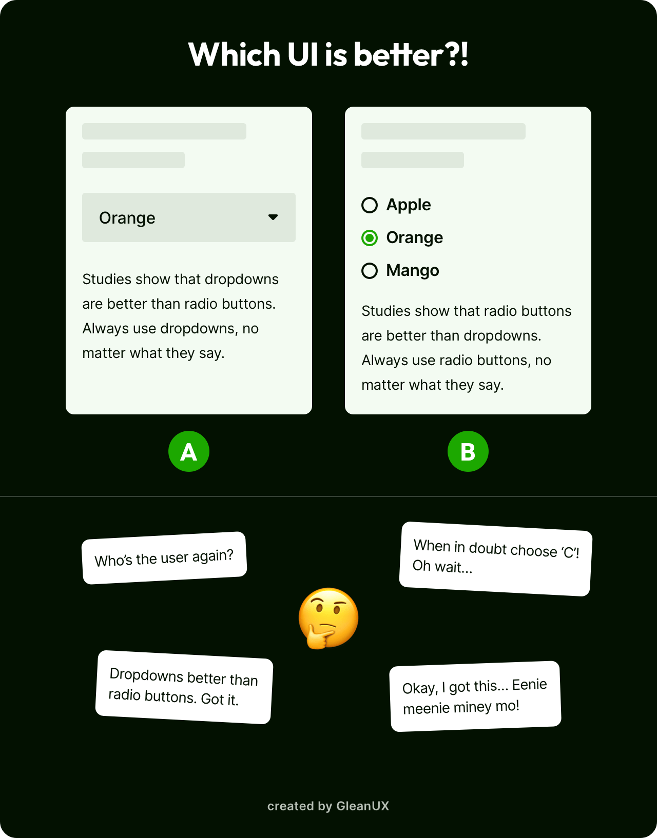
What we observed on social media and various blogs, was this trend of comparing two UI screens that were placed side by side. While, it may seem like a quick way to test your skills, we paused to ask the question 'What are these quizzes really testing?'.
Think about it, spotting issues between two almost identical images is not testing your UI skills, rather your eyesight. To put it bluntly, any layman (we mean a non-designer) with good eyesight can spot the differences between those two options.
On a UX front, none of these quizzes come with any background on what the problem is, or the task the user is trying to achieve with it. How could we make a decision on 'Which UI is better?' if we do not know the purpose behind the UI in the first place?
Finally (and most importantly), we want to point out that, in the real-world when working on projects, you most likely will be given an experience and are expected to find the problems yourself. You may not get two or more options to choose from as the 'better ux'.
Therefore, through the YearOfUX we want to challenge the norm and disrupt this trend to provide a more effective and meaningful solution. For each quiz, we give a prompt and a snapshot of the experience. That's it!
It's up to you as the designer to read the prompt and decifer the problem. At the end of each quiz, we have given our solution and have stated the reasons behind it. We'd love to see your answers and hear your feedback, so feel free to reach out to us via e-mail.
And with that, we hope you enjoy the YearOfUX.
PLEASE STAY AWAY FROM THESE 👇

Develop your UX muscle, one week at a time! 💪
You most likely won't regret it.